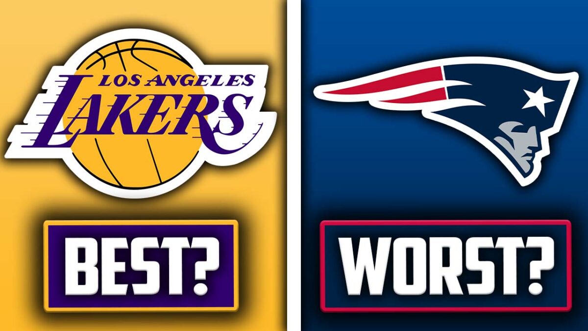
Sports logos are a true staple that immediately identifies an iconic team whether it is the New York Yankees, Green Bay Packers, or Los Angeles Dodgers. A logo captures the team’s image in an instant with a recognizable iconic look and colors that can stand out for decades. However, some logos need to be thrown away, redone and revamped for a more modern and new iconic look. Here are ten of the best logos in all of Pro Sports and the ten absolute worst.
Which sports logos are the best and which ones need some improvement?
Best: New York Yankees
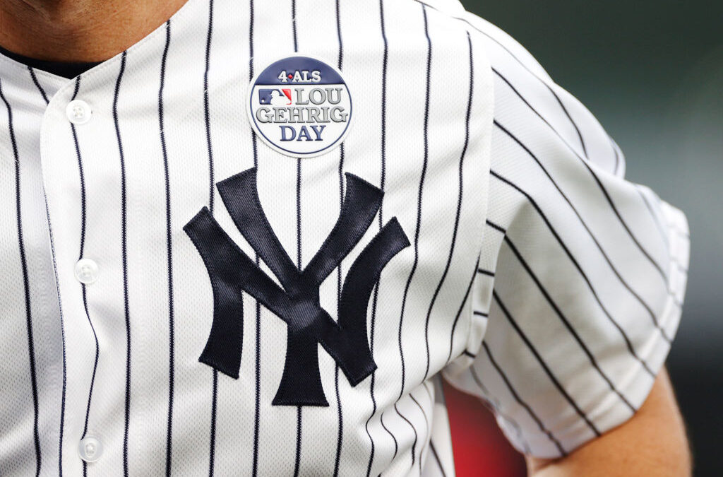 NEW YORK, NEW YORK – JUNE 02: Detail of a jersey patch worn by DJ LeMahieu #26 of the New York Yankees for Lou Gehrig Day during the first inning of Game Two of a doubleheader against the Los Angeles Angels at Yankee Stadium on June 02, 2022 in the Bronx borough of New York City. (Photo by Sarah Stier/Getty Images)
When it comes to iconic logos, the Yankees have arguably one of the most recognized logos in all of professional sports. From athletes like Babe Ruth, Lou Gehrig, Joe DiMaggio, Mariano Rivera, Derek Jeter, and Aaron Judge to celebrities like Jay-Z and Spike Lee, the Yankees’ dominance for decades also helped the logo become an iconic staple for generations to come. It is synonymous with New York itself.
Worst: Arizona Diamondbacks
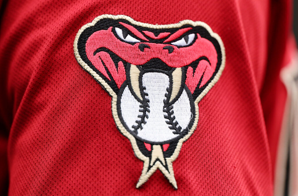 CHICAGO, ILLINOIS – SEPTEMBER 08: A detail of a Arizona Diamondbacks logo on a jersey against the Chicago Cubs at Wrigley Field on September 08, 2023 in Chicago, Illinois. (Photo by Michael Reaves/Getty Images)
The Diamondbacks logo isn’t the most appealing of the sports logos. The mixture of red, black, and teal looks good on paper, but the actual logo itself doesn’t look menacing enough as it’s just an A with the tongue of a snake. The original purple and copper colors were more iconic than the current color scheme. Yes, we understand that there are a lot of venomous snakes in the American Southwest where the Diamondbacks got their name. If the Diamondbacks want a truly awesome logo, make the logo more like their namesake and go with black, tan, brown and beige with maybe a pop of orange.
Best: Los Angeles Dodgers
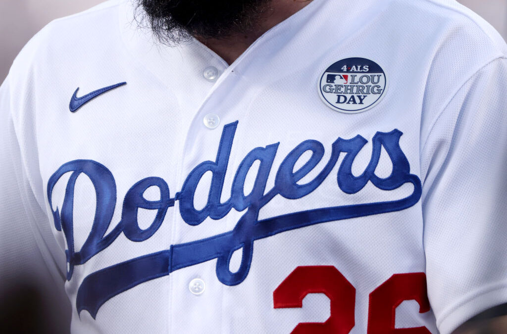 LOS ANGELES, CALIFORNIA – JUNE 02: A detailed view of the jersey of Tony Gonsolin #26 of the Los Angeles Dodgers for Lou Gehrig Day during the first inning against the New York Mets at Dodger Stadium on June 02, 2022 in Los Angeles, California. (Photo by Katelyn Mulcahy/Getty Images)
Similar to the New York Yankees, the LA Dodgers logo has been very iconic since its inception in 1958 when the team moved from Brooklyn to Los Angeles. The royal blue LA cap has also been seen on multiple iconic athletes and celebrities alike and has also had very successful teams capture the World Series championship over the decades. The script “Dodgers” lettering on the logo is also very iconic and is very well recognized all over the world.
Click on ‘Follow Us’ and get notified of the most viral NFL stories via Google!Follow Us
Worst: Los Angeles Rams
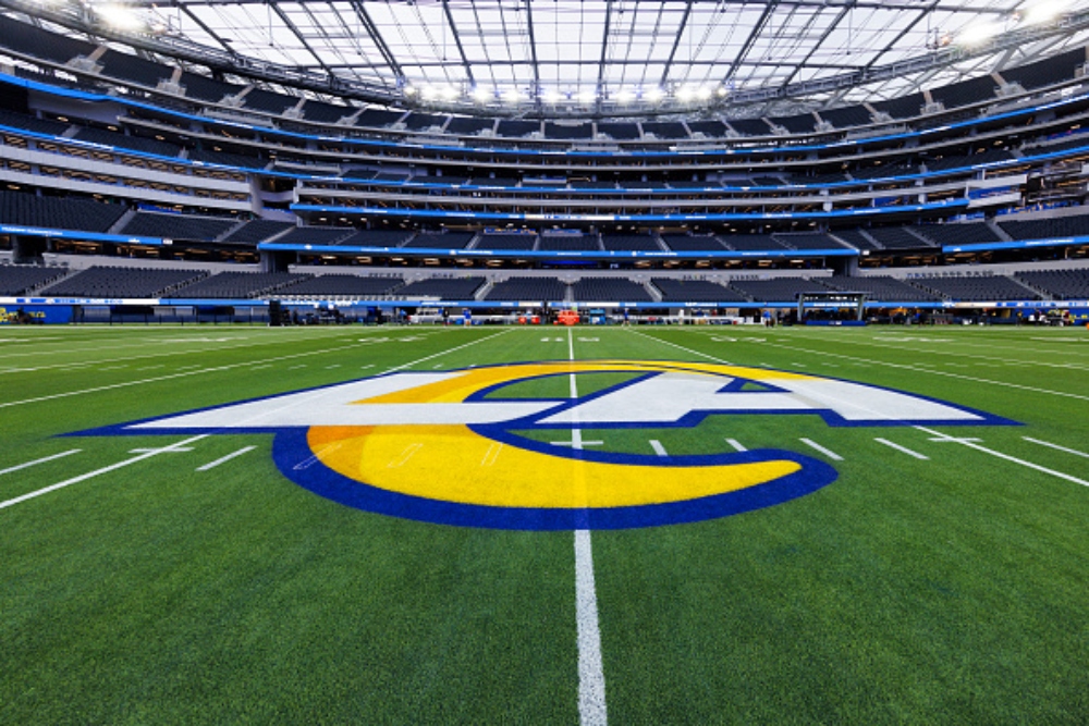 INGLEWOOD, CALIFORNIA – DECEMBER 21: A general view of the interior of SoFi Stadium with Los Angeles Rams logo painted on the field before a game against the New Orleans Saints at SoFi Stadium on December 21, 2023 in Inglewood, California. (Photo by Ric Tapia/Getty Images
Yes, the Rams did win Super Bowl 56, but the current Rams logo is not well received. Many fans of the team don’t approve of the current Rams logo. They were much more excited about the team’s previous logo as it captured the menacing spirit of the team. The Rams would have been better served by making some minor adjustments to their sports logo. Instead, they chose to scrap it and go with the current logo which is just “LA” with yellow ram antlers. Hey there, Los Angeles Rams- take a look at the Los Angeles Chargers logo, theirs is a simple and just much better-looking. Please bring the old logo back.
Also Read: 10 Oddest Jersey Logos In NHL History That Are Big Regrets
Best: Manchester City F.C.
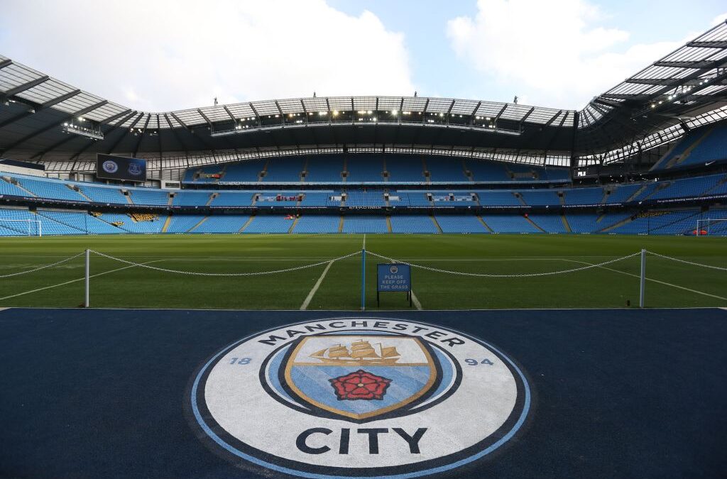 A general view of the pitch before the English Premier League football match between Manchester City and Everton at the Etihad Stadium in Manchester, north west England, on October 15, 2016. (Photo by SCOTT HEPPELL/AFP via Getty Images)
Manchester City’s current logo, which was introduced in 2016, is like a work of art. From the ship floating on the water, which represents trade with the world, to the bottom of the logo shield with its blue stripes, representing the city of Manchester’s three rivers: the Irk, the Irwell, and the Medlock Rivers, and the Lancashire rose, which is an iconic flower in Manchester. It’s an amazing logo for an iconic soccer team. We could learn a lot about the history and power of a symbol for across the pond.
Worst: New England Patriots
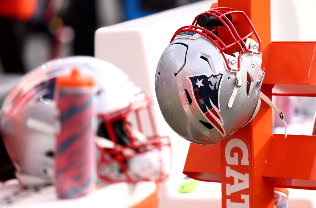 FOXBOROUGH, MASSACHUSETTS – OCTOBER 22: A New England Patriots helmet on the bench during the game against the Buffalo Bills at Gillette Stadium on October 22, 2023 in Foxborough, Massachusetts. (Photo by Maddie Meyer/Getty Images)
Even though the current Patriots logo is popular, it does look like a floating “Elvis” head. The original “Pat the Patriot logo” used from 1960 until 1992 was much better looking and symbolized what it meant to be a New England Patriot. The current logo, which has been around since 1993, can be a bit cheesy at times, but the uniforms the Patriots wore from 2000 until 2019 made up for it, as they became a super dynasty under the leadership of Tom Brady, Bill Belichick, and team owner, Robert Kraft.
Best: Milwaukee Brewers
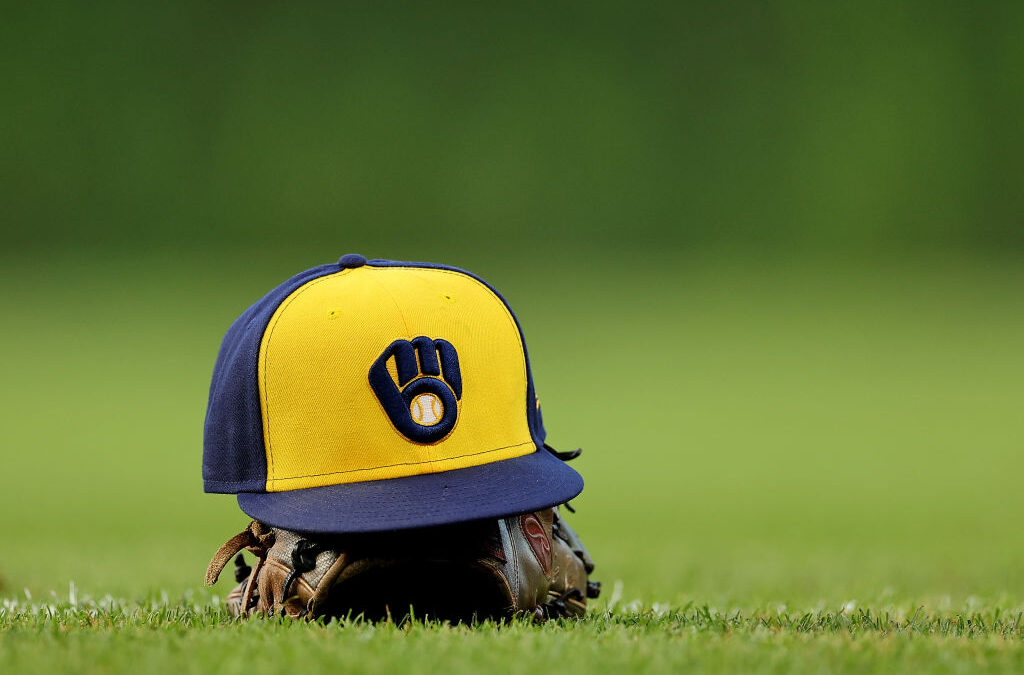 CHICAGO, ILLINOIS – AUGUST 28: A detail of a Milwaukee Brewers hat prior to the game against the Chicago Cubs at Wrigley Field on August 28, 2023 in Chicago, Illinois. (Photo by Michael Reaves/Getty Images)
Oh, happy days! The Brewers brought their iconic baseball glove logo back in 2020. What makes this sports logo so iconic is the M for Milwaukee used for the top of a baseball glove and the lowercase B making up the pocket of the glove, with a caught ball in it. The logo also beautifully utilizes the team colors of blue and yellow. Hopefully, we will see the Brewers and their iconic logo in a World Series in the coming future.
Worst: Columbus Crew
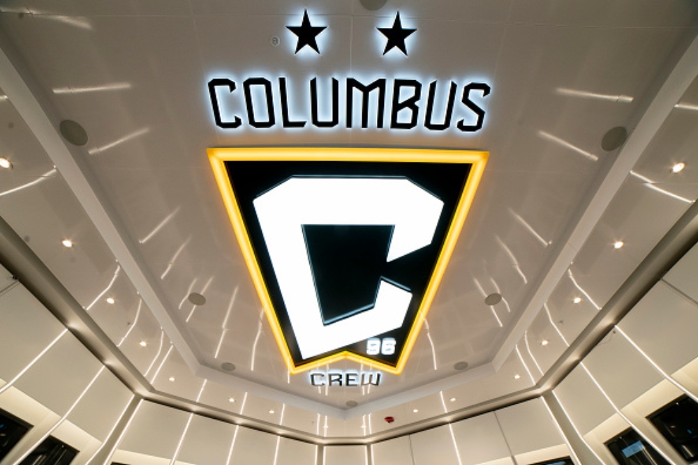 COLUMBUS, OH – JUNE 29: Columbus Crew Logo on ceiling of the team locker room during the ribbon cutting ceremony held at Lower.com Field in Columbus, Ohio on June 29th, 2021. (Photo by Jason Mowry/Icon Sportswire via Getty Images
The Columbus Crew’s logo is simple but doesn’t have much going on. Yes, the black and yellow looks great. However, sometimes simple isn’t good enough, as the logo looks pretty plain and bland at best. The Crew’s previous two logos are much better looking than their current logo. Go back to the design room, Columbus Crew.
Best: Philadelphia Union
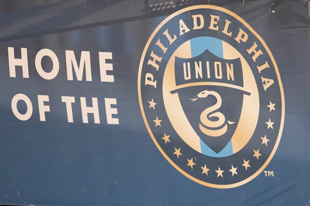 CHESTER, PA – AUGUST 29: A general view of the Philadelphia Union logo at Subaru Park prior to the match against the D.C. United on August 29, 2020 in Chester, Pennsylvania. The Philadelphia Union defeated D.C. United 4-1. (Photo by Mitchell Leff/Getty Images
The Philadelphia Union’s logo can be a sight to see. From the navy blue and gold to the snake emblem in the center, this is one of the best logos in Major League Soccer. The snake in the Philadelphia Union’s logo pays homage to the political cartoon, “Join or Die” by Benjamin Franklin, memorializing the City of Philadelphia’s role in American independence.
Worst: Detroit Pistons
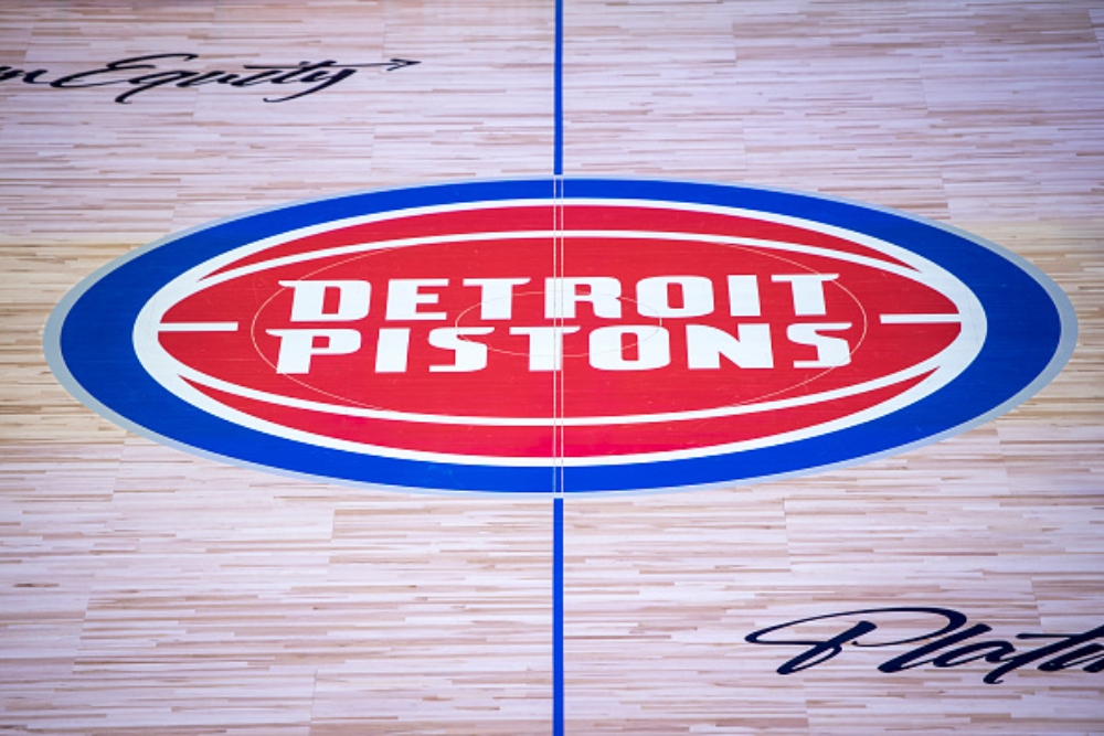 DETROIT, MICHIGAN – OCTOBER 30: The Detroit Pistons logo is pictured on the court before the game against the Orlando Magic at Little Caesars Arena on October 30, 2021 in Detroit, Michigan. (Photo by Nic Antaya/Getty Images
The Pistons introduced their current logo in 2017 honoring the “Bad Boy” pistons of the 1980s and 90s with the modern look of the current sports team. Unfortunately, this logo is pretty boring as it’s just the Detroit Pistons word mark on a basketball. The teal, black, yellow, and red flaming horse logo was the best logo the Pistons had from 1996 until 2001. Even though the team is struggling, we would love to see that awesome teal logo come back or redesign the logo with something more modern.
Best: Boston Celtics
 BOSTON – MAY 24: A detail of the Boston Celtics logo is seen on the court against the Orlando Magic in Game Four of the Eastern Conference Finals during the 2010 NBA Playoffs at TD Banknorth Garden on May 24, 2010 in Boston, Massachusetts. (Photo by Jim Rogash/Getty Images)
When it comes to iconic basketball, the Celtics fit that mold. The Celtics logo has been around since 1974 and was upgraded with some changes in 1996, helping make the Kelly green uniforms stand out. The logo centers on Boston’s Irish culture and the growth and progress of one of the NBA’s most successful franchises. Whenever people think about basketball in Boston, the first thing that comes to mind will always be the Celtics iconic logo.
Worst: Anaheim Ducks
 PHILADELPHIA, PENNSYLVANIA – OCTOBER 28: A view of the logo of the Anaheim Ducks on the jersey of Lukas Dostal #1 during warm-ups against the Philadelphia Flyers at the Wells Fargo Center on October 28, 2023 in Philadelphia, Pennsylvania. (Photo by Len Redkoles/NHLI via Getty Images
The Ducks’ current logo has been around since 2013, which is a shortened version of their logo of 2006- 2013. It may have the look of duck feet, but it falls flat, as it’s just a D that looks like a poorly put-together taco. The team’s original logo, when they were called The Mighty Ducks of Anaheim, is far superior, as it featured a duck hockey mask and two hockey sticks surrounded by a great combination of teal and purple. If the Ducks ever change their logo, they really should consider going back to the original.
Best: Los Angeles Lakers
 LOS ANGELES, CA – MAY 08: Los Angeles Lakers upper court view of the logo during game 4 of the NBA Western Conference Semifinals between the Golden State Warriors and the Los Angeles Lakers on May 08, 2023, at Crypto.com Arena in Los Angeles, CA. (Photo by Jevone Moore/Icon Sportswire via Getty Images
The Lakers logo may not have much to it but its simplicity and usage of purple and yellow has truly made it an iconic logo in all of professional sports. The logo was seen during the Lakers’ dominance during the 1980s with Magic Johnson and 2000s with Shaq and Kobe Bryant. Similar to the Boston Celtics, the Lakers also have a strong tradition of winning as their reputation reflects that.
Worst: Washington Commanders
 LANDOVER, MARYLAND – DECEMBER 31: A detailed view of a Washington Commanders helmet prior to a game against the San Francisco 49ers at FedExField on December 31, 2023 in Landover, Maryland. (Photo by Greg Fiume/Getty Images)
Although the Commanders’ current logo hasn’t been around for that long, the team’s name change and logo reveal were a flop. Burgundy and gold are always excellent colors. However, the logo is very generic and bland. The Commanders will never go back to their previous name, which they got rid of in 2020, but they should’ve made a better logo to fit the Commander’s name, as opposed to their current W logo. It’s time to command a new logo effort!
Best: Chicago Bulls
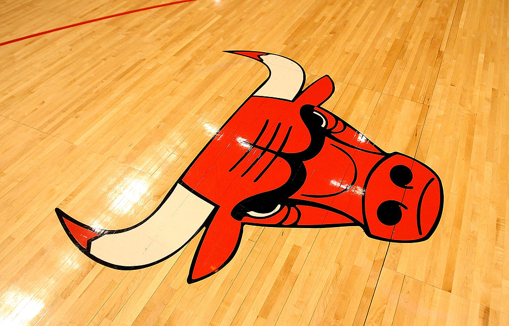 CHICAGO, IL – FEBRUARY 15: A Chicago Bulls logo is seen on the floor before a game between the Bulls and the Charlotte Bobcats at the United Center on February 15, 2011 in Chicago, Illinois. The Bulls defeated the Bobcats 106-94. (Photo by Jonathan Daniel/Getty Images)
The Bulls logo has been around since the team’s inception in 1966 and remains one of the most iconic logos in all of professional sports. The logo was designed by Dean P. Wessel and truly strikes fear against opposing teams. The menacing bull is a symbol of power, strength, and aggression, as the Bulls truly showed that throughout the years, especially during the 1990s with Michael Jordan and their six NBA championships. It goes to show that logos and winning teams go hand in hand.
Worst: Cleveland Browns
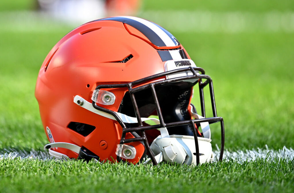 CLEVELAND, OHIO – NOVEMBER 05: A detail view of a Cleveland Browns helmet before the game against the Arizona Cardinals at Cleveland Browns Stadium on November 05, 2023 in Cleveland, Ohio. (Photo by Jason Miller/Getty Images)
The Browns’ current main logo is just their helmet, that’s about it. The orange helmet isn’t that interesting as a logo, as it’s very plain and bland. The new alternate dog logo is much better looking and really should be incorporated into the helmets and possibly replace the helmet logo as it’s more memorable and eye-catching. Please make it happen Browns!
Best: Pittsburgh Steelers
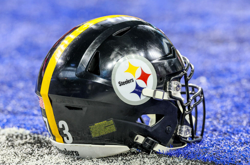 INDIANAPOLIS, INDIANA – DECEMBER 16: A Pittsburgh Steelers helmet sits on the field prior to a game against the Indianapolis Colts at Lucas Oil Stadium on December 16, 2023 in Indianapolis, Indiana. (Photo by Andy Lyons/Getty Images)
When you think of very iconic NFL logos, the Steelers are one of those teams with an incredible sports logo. The Steelers logo was first introduced in 1962 as an homage to the Steel industry that was dominant in Pittsburgh. The three colors in the Steelers’ logo represent the elements that make steel: yellow represents coal, red represents iron ore, and blue represents steel scrap. The logo is very simple yet beautiful, with a wonderful tribute to steelworkers.
Worst: Sacramento Kings
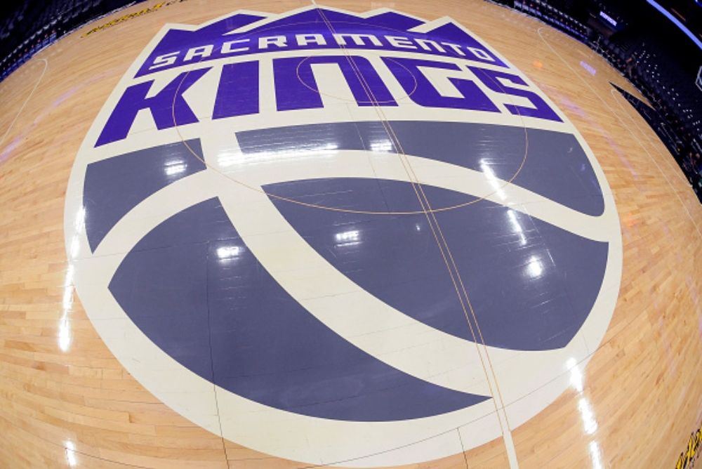 SACRAMENTO, CA – MARCH 27: A general shot of the Sacramento Kings center court logo prior to the game between the Minnesota Timberwolves and Sacramento Kings on March 27, 2023 at Golden 1 Center in Sacramento, California. (Photo by Rocky Widner/NBAE via Getty Images
Yes, the purple in the Kings screams royalty, yet the logo looks more peasant than royalty. Although the logo is paying homage to the Kings teams of the past, with the current colors, the logo is very boring. Their previous logo from 1994 until 2016 was much more memorable and catchy with the two knight jousts, large lettering, gray crown, and purple basketball. If the Kings decide to create a new logo, please consider bringing back the logo used from 1994-2016.
Best: Green Bay Packers
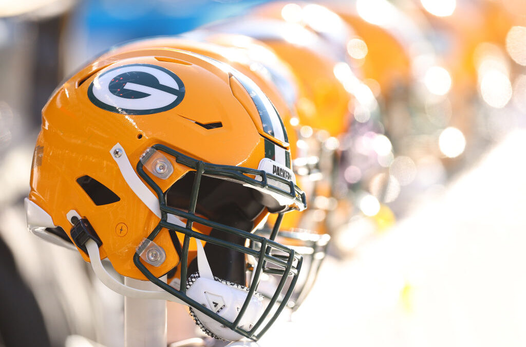 CHICAGO, ILLINOIS – DECEMBER 04: A detail of a Green Bay Packers helmet during the first half against the Chicago Bears at Soldier Field on December 04, 2022 in Chicago, Illinois. (Photo by Michael Reaves/Getty Images)
Whether you like them or hate them, we all have to admit the Green Bay Packers have one of the best logos in all of professional sports. From the white G wrapped in green and yellow on a yellow helmet- screams awesomeness from afar. The shape of the G was also made to resemble the shape of a football as one of the most expressive logos in a minimalist style. Some of the best football players have played under this great logo, like Bart Starr, Willie Wood, Brett Favre, Charles Woodson, and Aaron Rodgers.
Worst: Brooklyn Nets
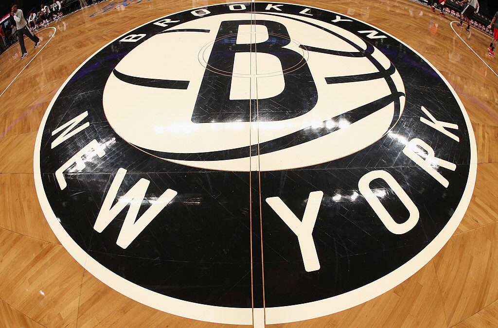 NEW YORK, NY – NOVEMBER 25: The Brooklyn Nets logo adorns center court prior to the game against the Portland Trail Blazers at the Barclays Center on November 25, 2012 in the Brooklyn borough of New York City. (Photo by Bruce Bennett/Getty Images)
Although the team has been in Brooklyn since 2012, the Nets logo is bland with a capital B. The logo features a B on a basketball, and that’s about it. The Nets’ older logos from their time in New Jersey were much better looking and more appealing than their current black-and-white logos. If the Nets truly wanted to make a better logo, they should go back to the design shop and bring some Brooklyn style into the house.
News
Lucci Disobeyed Orders and Attacked Luffy on Sight
One Piece’s Egghead Arc has pushed Monkey D. Luffy and his Straw Hat Pirate allies to their limits as the story kicks off the franchise’s final saga….
Nami Live Action Version
The Thai beauty queen reminds me of a famous manga/anime character. In recent days, the manga/anime fan community around the world in particular and movie fans in…
Just One Small Action, Messi’s Wife Received a ‘Shower of Compliments’
Antonela Roccuzzo, wife of superstar Lionel Messi, has received countless compliments for her warm actions towards a fan. Superstar Lionel Messi is preparing with his Argentina teammates…
10 Funniest Luffy Moments in One Piece
Humor is a staple of the One Piece franchise, coloring countless entertaining interactions between its beloved ensemble of unforgettable characters. Comedy is infused into the narrative and championed by…
Every One Piece Character Who Carries The Will Of D., Explained
One Piece is full of mysteries, including the titular treasure that Monkey D. Luffy and the Straw Hat Pirates have worked towards since the series’ inception. However, there…
One Piece: Every Straw Hat Pirate’s Fighting Style.
Between the endless variety of Devil Fruits, the multiple forms of Haki, and other viable options for achieving strength that exist within the setting, One Piece has one of…
End of content
No more pages to load
